Plotting
Python has a large collection of plotting libraries and while any content that rendens in a Jupyter Notebooks will render in Jupyter-flex dashboards there are some things to consider for plots to look the best they can.
Interactive (JS) libraries
Since jupyter-flex dashboards have a web frontend, either static .html files or a running webserver, in general any library that outputs a web based plot will look better, for example: Altair, plotly, Bokeh and bqplot.
Responsive
For plots to look great in flex dashboards they should be responsive, that means that they should ocupy all the space that the parent html components has instead of having a static width and heigth.
A responsive behaviour is usually not the default for most plotting libraries but it's very easy to change this even if the way to do this changes from library to library, here are some tips to make this happen in the most popular plotting libraries.
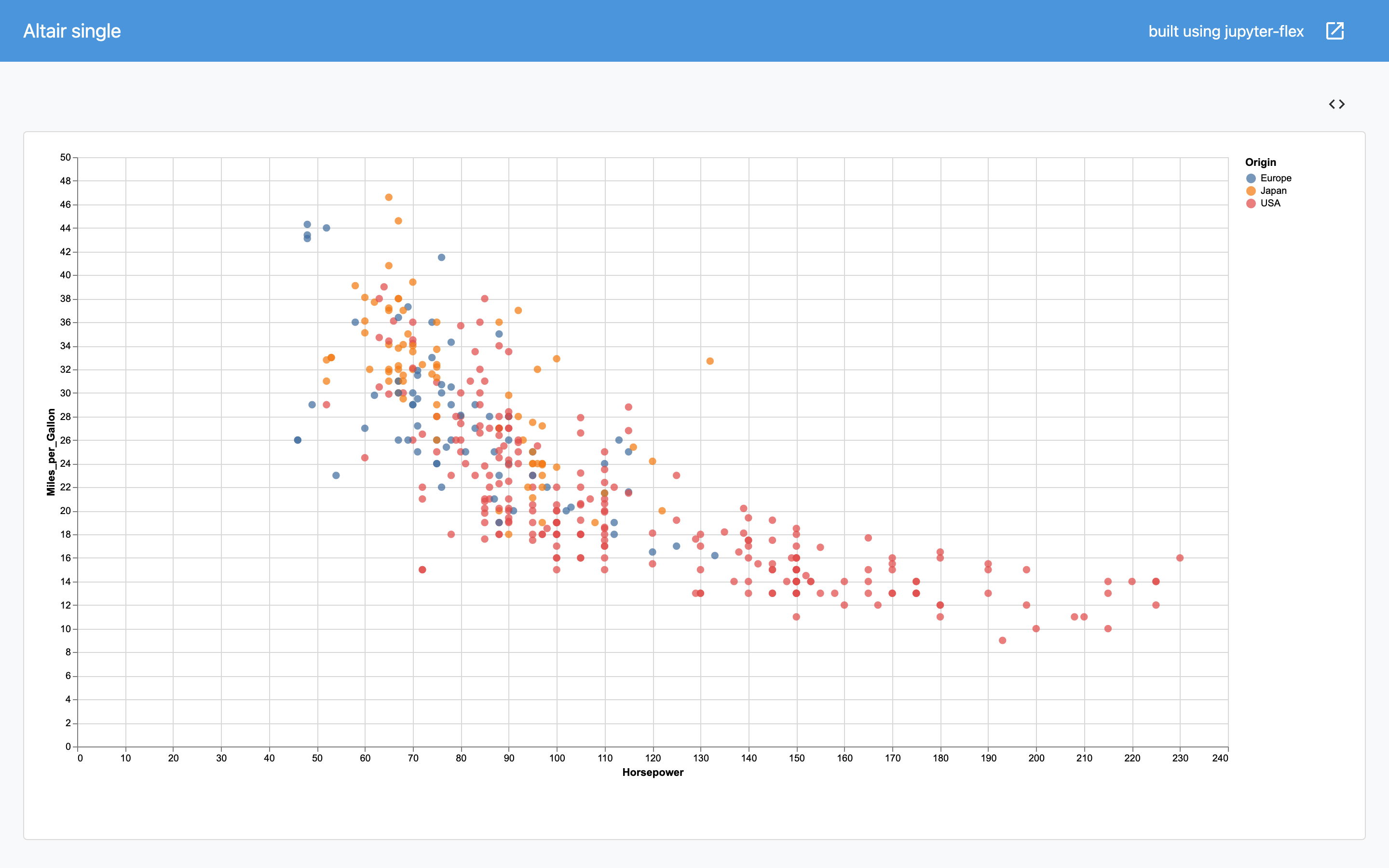
import altair as alt
from vega_datasets import data
source = data.cars()
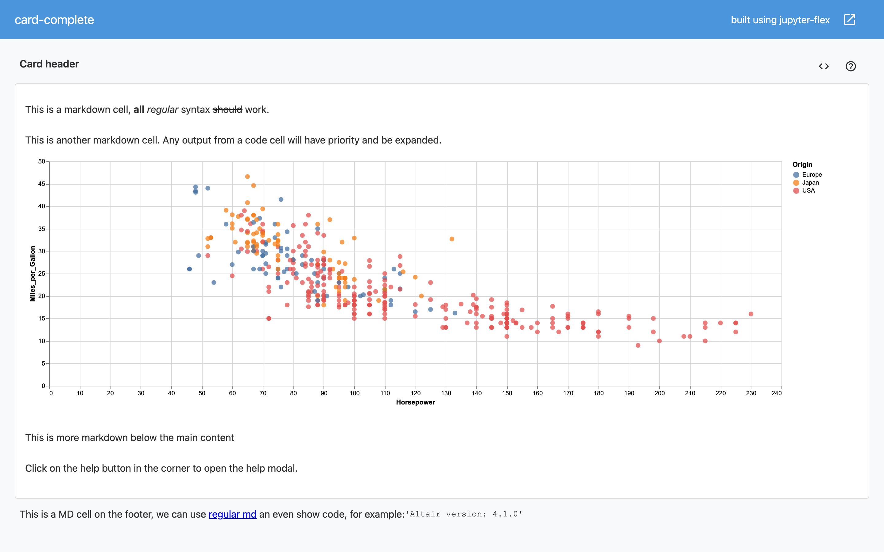
plot = alt.Chart(source).mark_circle(size=60).encode(
x='Horsepower',
y='Miles_per_Gallon',
color='Origin',
tooltip=['Name', 'Origin', 'Horsepower', 'Miles_per_Gallon']
)
plot
If we tag the previous cell with body then the size will be static and not responsive, to make it responsive we just add a bit of code:
plot.properties(
    width='container',
    height='container'
)
This could could make the plot invisible the Jupyter Lab or Jupyter Classic interface but will look great and expanded in the dashboard.
It's usually easy to add the call to property() once you are done with the Notebook or control this globally using a variable.
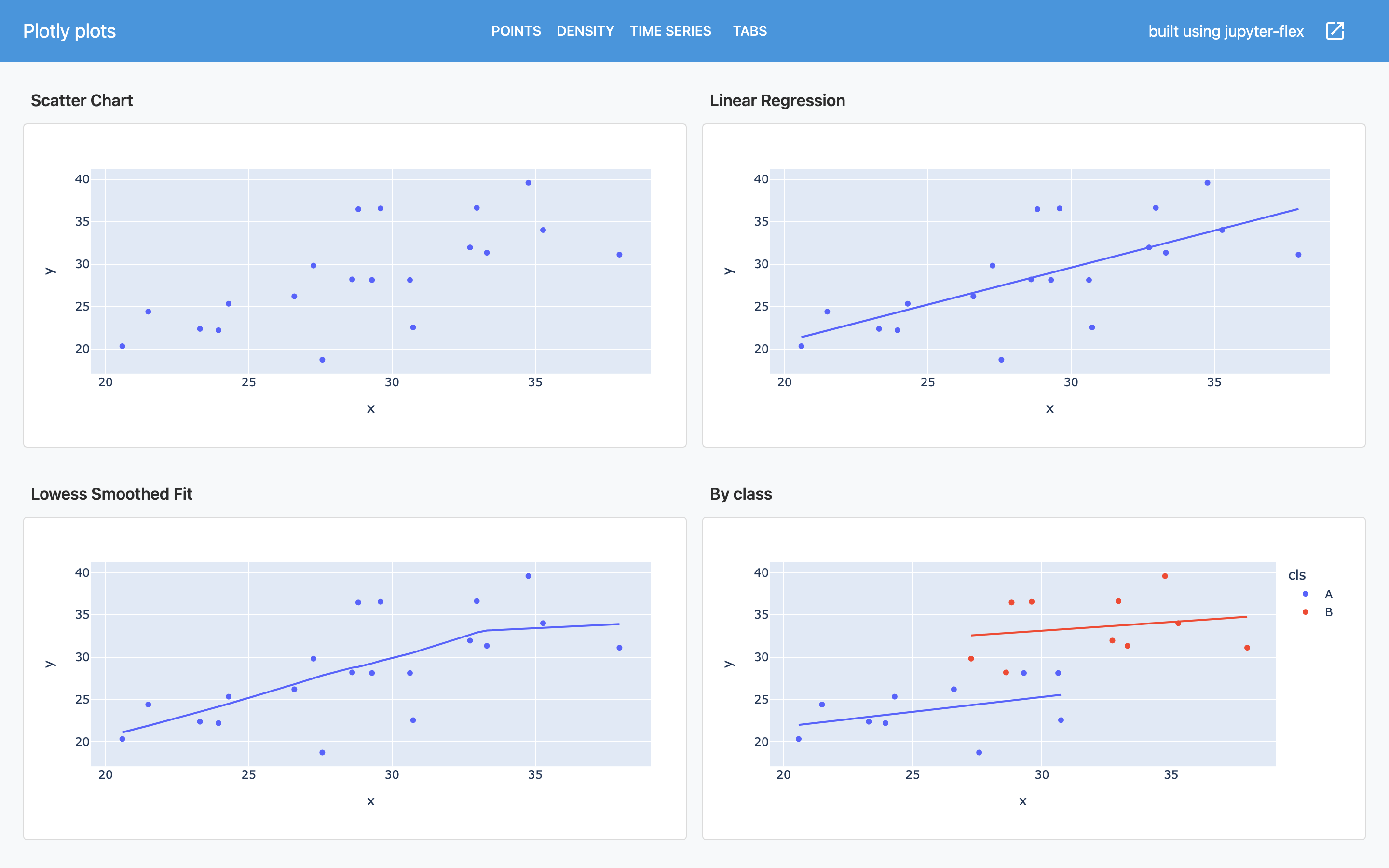
import plotly.express as px
import plotly.graph_objects as go
margin = go.layout.Margin(l=20, r=20, b=20, t=30)
df = px.data.iris()
fig = px.scatter(df, x="sepal_width", y="sepal_length")

fig.update_layout(margin=margin)
None
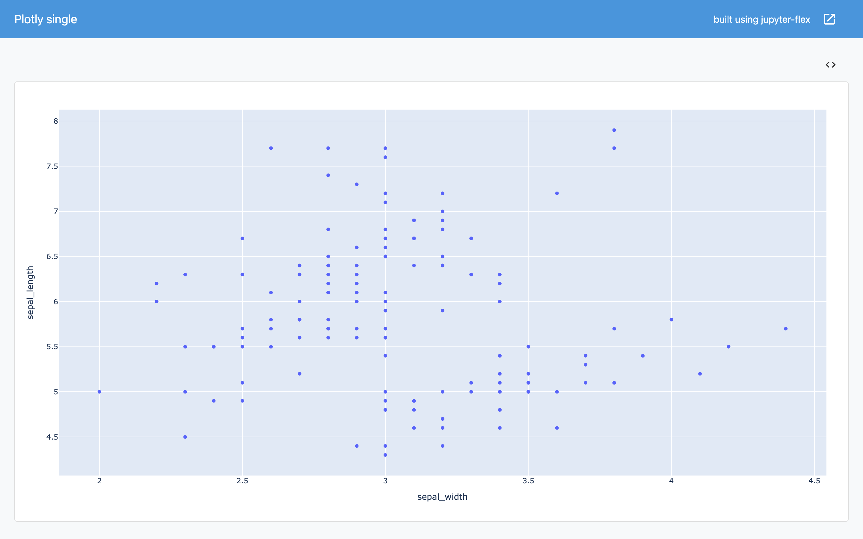
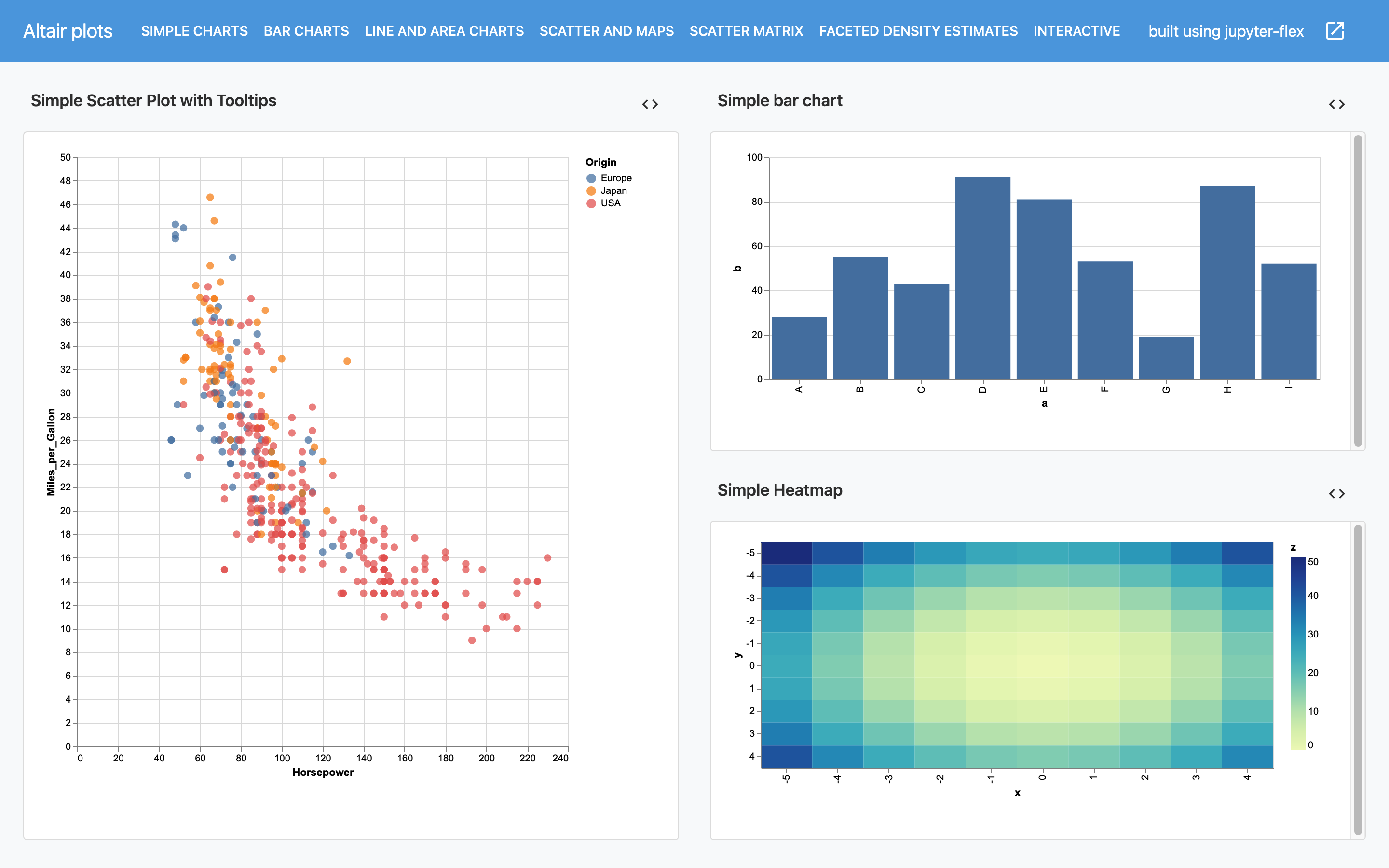
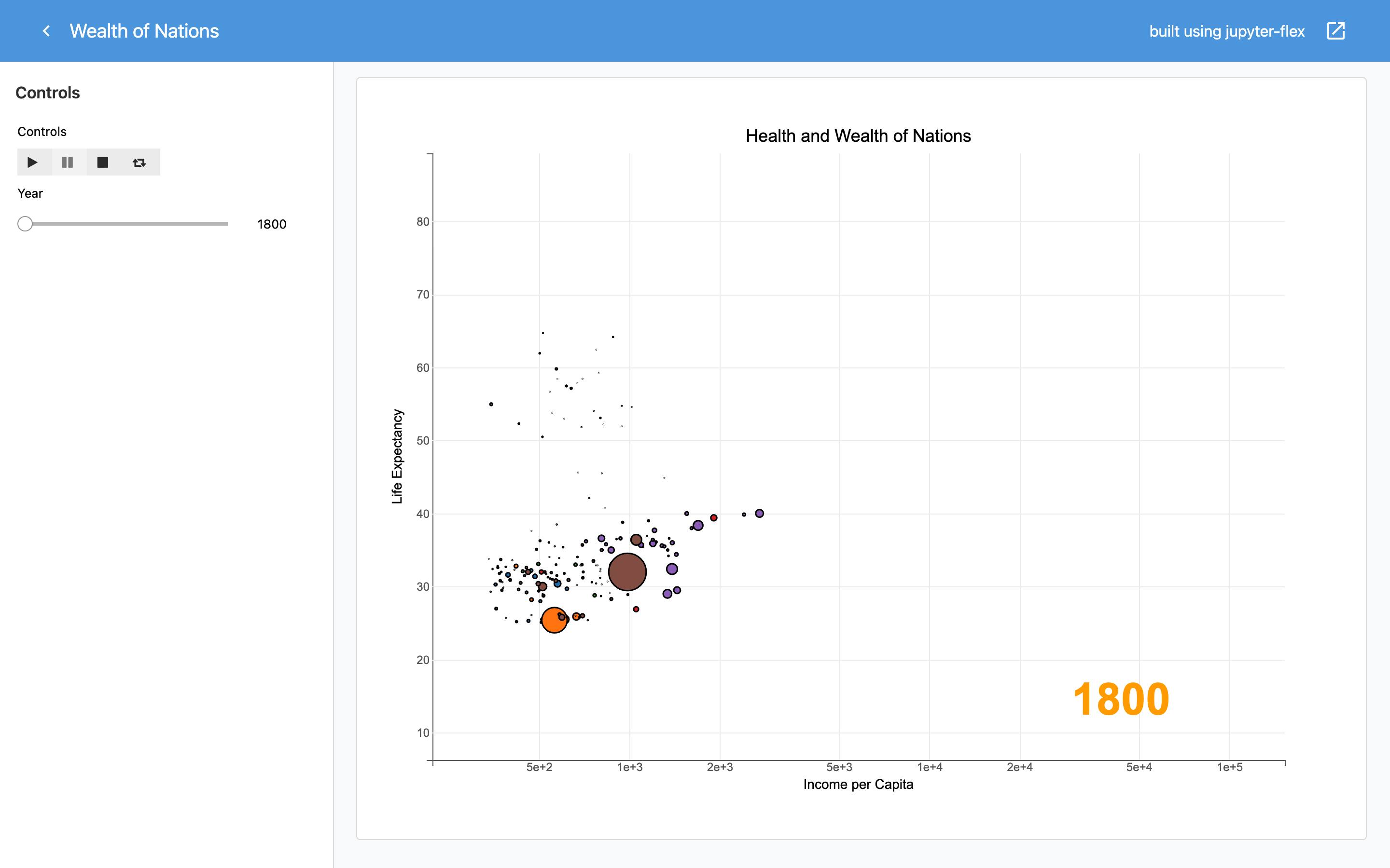
Click on the image to open the dashboard
Bokeh
Using Bokeh plots in Jupyter-flex dashboard requires two things:
- One
metatag in the cell that doesoutput_notebook()to embed the bokeh JS code in the notebook. Themetatag will add that cell to the dashboard.htmlwith thedisplay: none;style - Add
sizing_mode="stretch_both"to the Bokehfigure()call
For example:
x = np.linspace(0, 4 * np.pi, 100)
y = np.sin(x)
fig = figure(sizing_mode="stretch_both")
fig.line(x, y)

# show(fig)
Similar to what happens in Altair we see that the plot might not look its best well in the Jupyter Notebook interface (or these docs) but renders great in the dashboard.
It's usually easy to add the sizing_mode="stretch_both" code once you are done with the Notebook or control this globally using a variable.
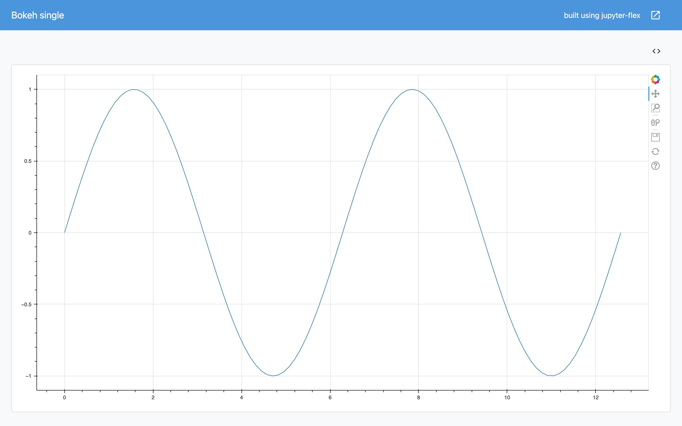
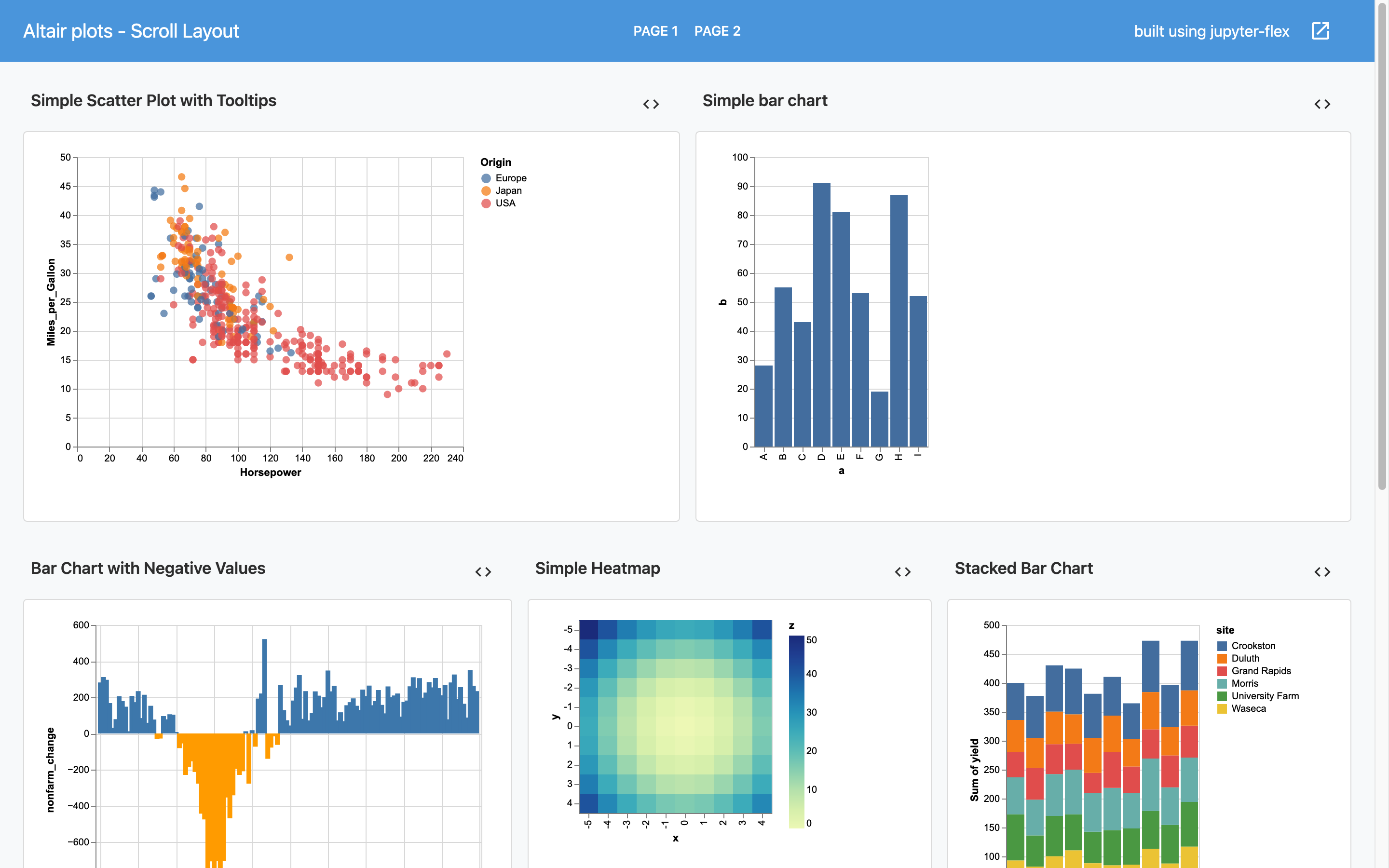
Click on the image to open the dashboard
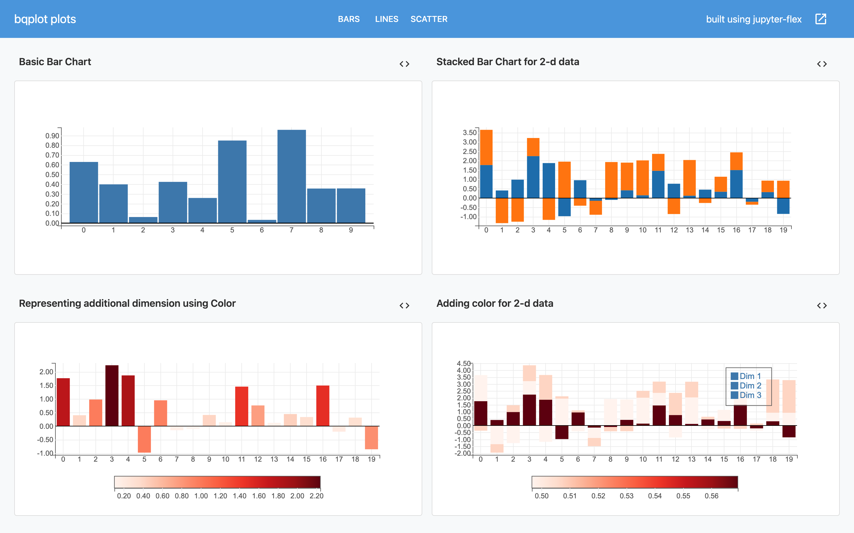
import numpy as np
from bqplot import *
size = 100
np.random.seed(42)

x_data = range(size)
y_data = np.random.randn(size)
y_data_2 = np.random.randn(size)
y_data_3 = np.cumsum(np.random.randn(size) * 100.)
x_ord = OrdinalScale()
y_sc = LinearScale()

bar = Bars(x=np.arange(10), y=np.random.rand(10), scales={'x': x_ord, 'y': y_sc})
ax_x = Axis(scale=x_ord)
ax_y = Axis(scale=y_sc, tick_format='0.2f', orientation='vertical')

Figure(marks=[bar], axes=[ax_x, ax_y], padding_x=0.025, padding_y=0.025)
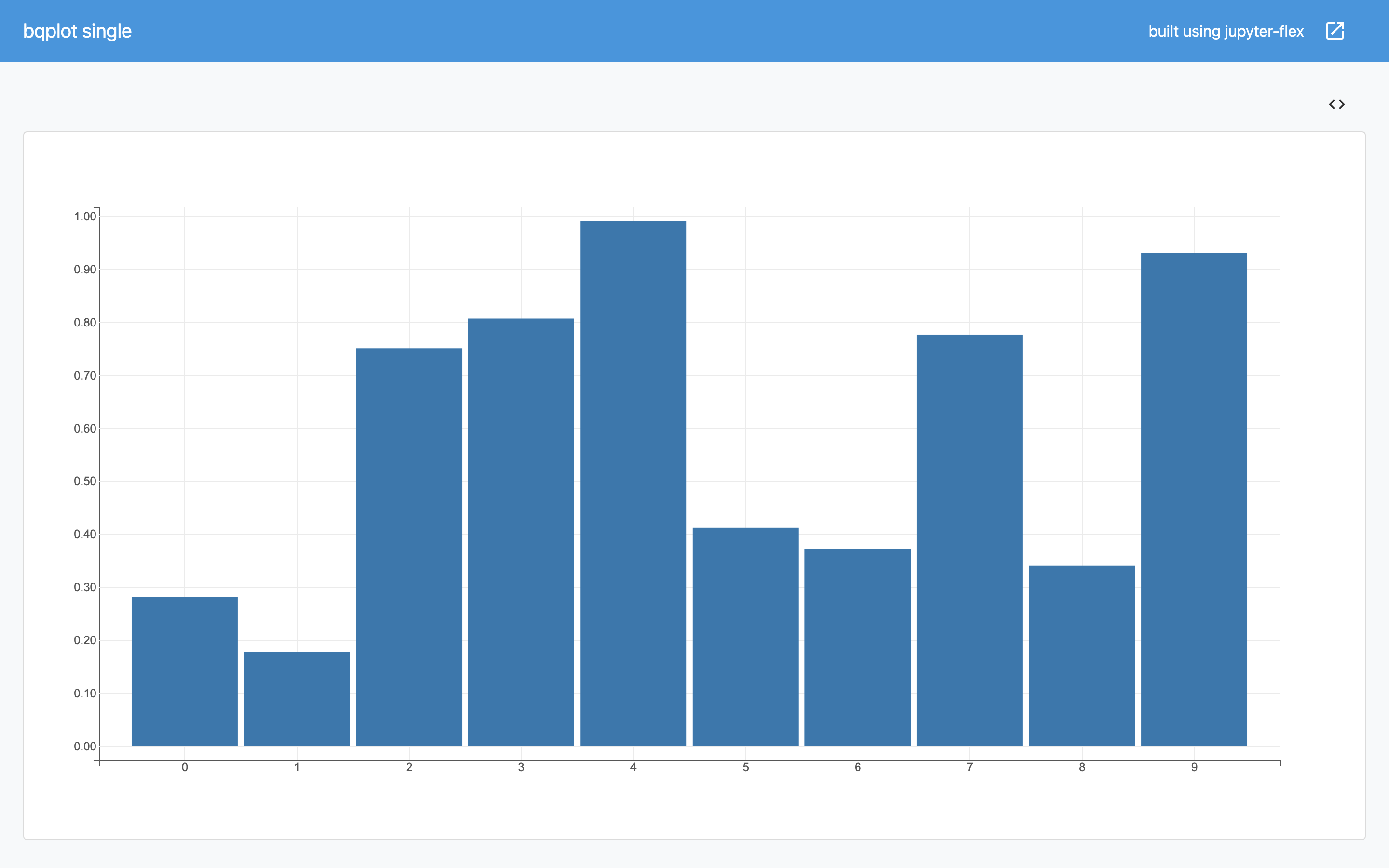
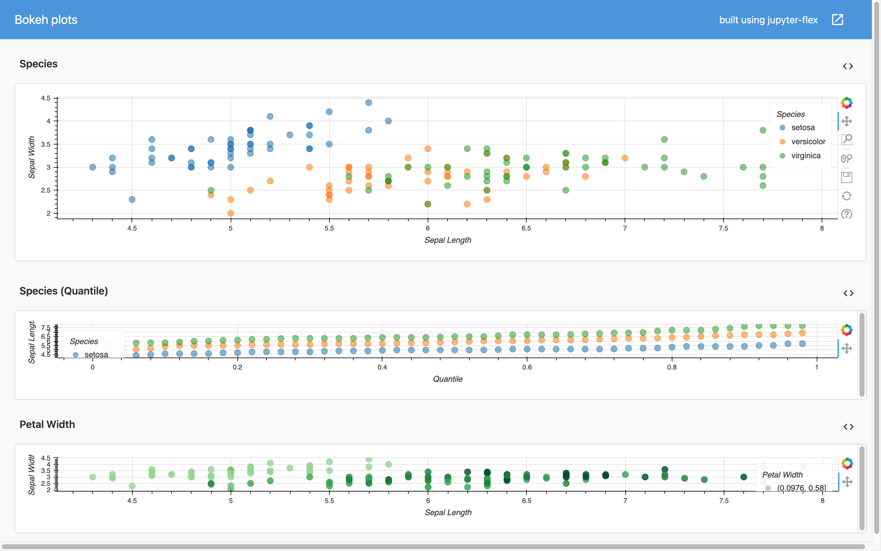
Click on the image to open the dashboard
Updating plots
When using Voila and IPython widgets to dynamically update the content of plots in the dashboard there are some things to consider:
- If the library has native support for IPython Widgets then it's a good idea to use that functionality, this is possible in:
- bqplot because the library is designed that way
- plotly using Figure Widget
- If the library doesn't have native support for Jupyter widgets it's still possible to use it and update the dashboard the using Output Widgets
When using Output Widgets remember to call clear() before displaying new content, for example:
out = widgets.Output()

with out:
    out.clear_output()
    display(...)
It's common to have the with out: ... code inside a callback function from a widgets observe() method.
Examples
More examples that show the plotting libraries in action and other examples that show how to have more dyamic dashboards with Jupyter widgets: